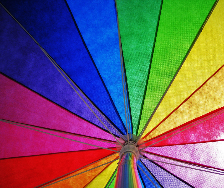
Color's impact on life

One of the five elements of Balance Concierge’s Circle of Well-Being is “LIFESTYLE.” This element covers a wide range of topics from relationships, routines, activities, recreation, entertainment, living environment, and more. Today we’re discussing a significant factor in the environment around us at home and work: color.

CD Reflecting Rainbow of Light.pngSir Isaac Newton, an English scientist, was the first to define in 1666, what color is: a single wavelength of light that cannot be further separated. He discovered this when realizing that pure white light passing through a prism produces a full spectrum of colors. Water droplets in the air such as mist, rain, and waterfalls work just like prisms. Rainbows appear when sunlight shines through the droplets. The resulting colors can be muted if it is foggy or vibrant if the sun is bright.

Researching the rainbow

Prairie Rainbow.pngSpeaking of the sun, have you ever noticed how your mood changes with the weather? Maybe you aren’t personally as affected by dramatic gray skies as some people are, but if you have been in the field of health care for very long, it is hard to ignore the impact of beautiful clear blue skies vs. storms on your patients. According to research reported by Sara Pope MGA in The Healthy Home Economist from 1932, visible wavelengths of light may have a direct effect on the endocrine system because they can reach the pineal and pituitary glands in the brain through neurochemical channels that operate independently of the optic nerve. This discovery means that color can affect us without actually being “seen.” We can sense its presence even when we’re not paying attention to it.

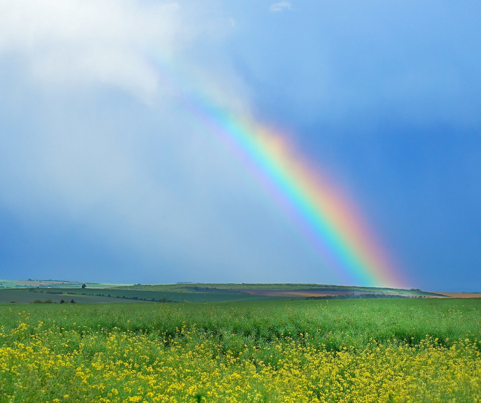
The feelings and moods certain colors tend to evoke do impact our behaviors. The evidence behind this statement is complex considering we all have unique experiences and cultural influences that blend with color to produce differing results. However, anecdotal, theoretical and empirical research all point to the same conclusion. Color is a powerful force in our lives.

Pastel Colors.pngTake for instance the research in 1978 that proved that the color pink could “calm hostile or angry emotions – even to the point of weakening muscles within 10-15 minutes” and “in contrast the color blue caused the subjects’ muscle strength to quickly return.” It’s one thing to make these claims in a lab, but when commanding officers in the Seattle U.S. Naval Correctional Center, law enforcement officers in San Bernardino County Probation Department, and other jails report the same findings being helpful in their work with violent inmates the study sounds pretty accurate. The University of Iowa’s football stadium is trying out a shade of pink in the visiting team’s locker room. Maybe anyone with a bullying problem should try using a little pink, and a confidence challenge should suit up in royal blue.

More recent studies published on the U.S. National Library of Medicine, National Institutes of Health website PubMed.gov report that a person’s motor skills are enhanced with force and velocity when they perceived the color red. (2011)  So, it may be helpful for athletes to wear red. However, red is also “associated with the danger of failure in achievement contexts” (2007) and we avoid those red edits on graded papers in schools and reports at work.  So, schools with red as one of their spirit colors should steer clear of painting with that color, especially in classrooms where students take tests.

Rainbow Umbrella.pngOn the other hand, the color red in marketing and consumer design is all about the emotions of romance, power, action, and confidence. From a psychological and physical perspective, people in environments with a lot of red influences tend to be more energetic, excited, and passionate. They release more adrenaline, have heightened senses, and have higher heart rates and blood pressure. Red is a warm color that is also associated with love and happiness as well as anger and danger. When decorating with any hue of red, use it as an accent to draw attention to a specific area instead of overwhelming your space.

Orange is also a warm and energetic color. Depending on the shade chosen, oranges can be fun and friendly or grounded and comforting. Like red, it evokes excitement but is more enthusiastic and balanced than aggressive. According to a freshome.com blog post, some ancient cultures believed orange aided in the healing of lungs and increased energy levels. It sounds like the perfect color for anywhere deep breathing and creativity are needed such as fitness corners, workout areas, offices, and conference rooms.

Yellow Paint with Roller.pngIf you want to expand your smaller spaces to feel more welcoming and capture the uplifting joy of sunshine, give yellow a try. It is excellent in a bathroom, for instance, because it is associated with alertness and optimism. Both are helpful in early morning routines. Just don’t overdo it. Too much of a good thing can be irritating to the eyes and tempers. If using yellow in a baby’s room, go with a very pale shade and accent it with other cool and soothing colors.

Therapeutic impact

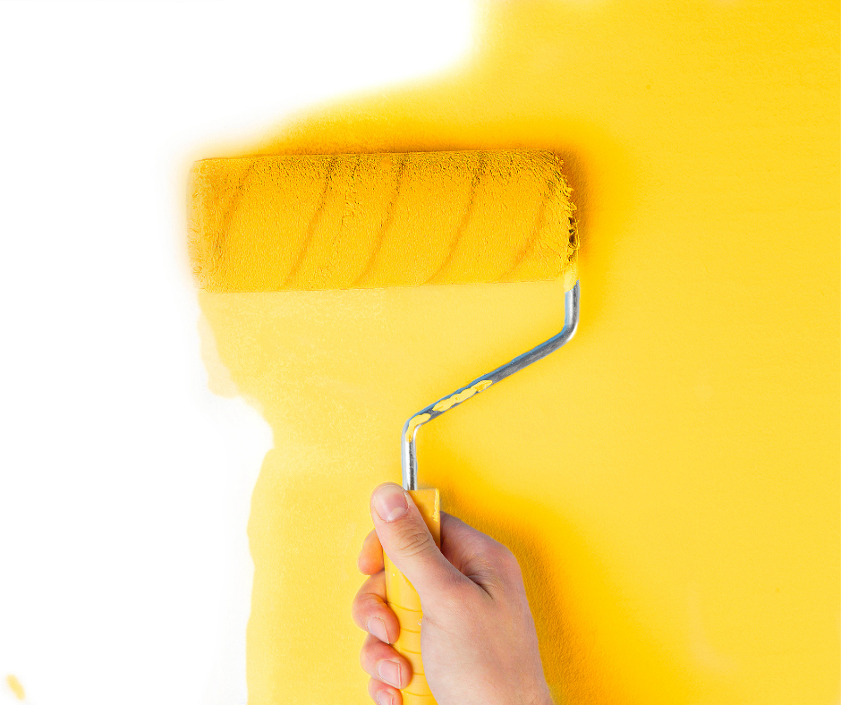
Chromotherapy, also known as color therapy and color healing, has very detailed properties associated with each color based on the combined study of ancient healers’ usage of light and color along with modern scientific research. The color yellow in Chromotherapy is typically not liked by those who are dealing with disappointment, tend to rationalize feelings, and avoid the depth of life by moving in and out of activities and relationships often. People attracted to the color are usually more cheerful, curious, flexible, progressive and practical in their thinking, and light-hearted. They are lifelong learners, like to travel, have deep and meaningful relationships, and are good communicators.

Greens and Blues.pngIn nearly all studies that involve an emotional reaction to color, blue, blue-green (think aqua, teal, and turquoise), greens, deep reds, and purples are listed as the most pleasant hues. (1994

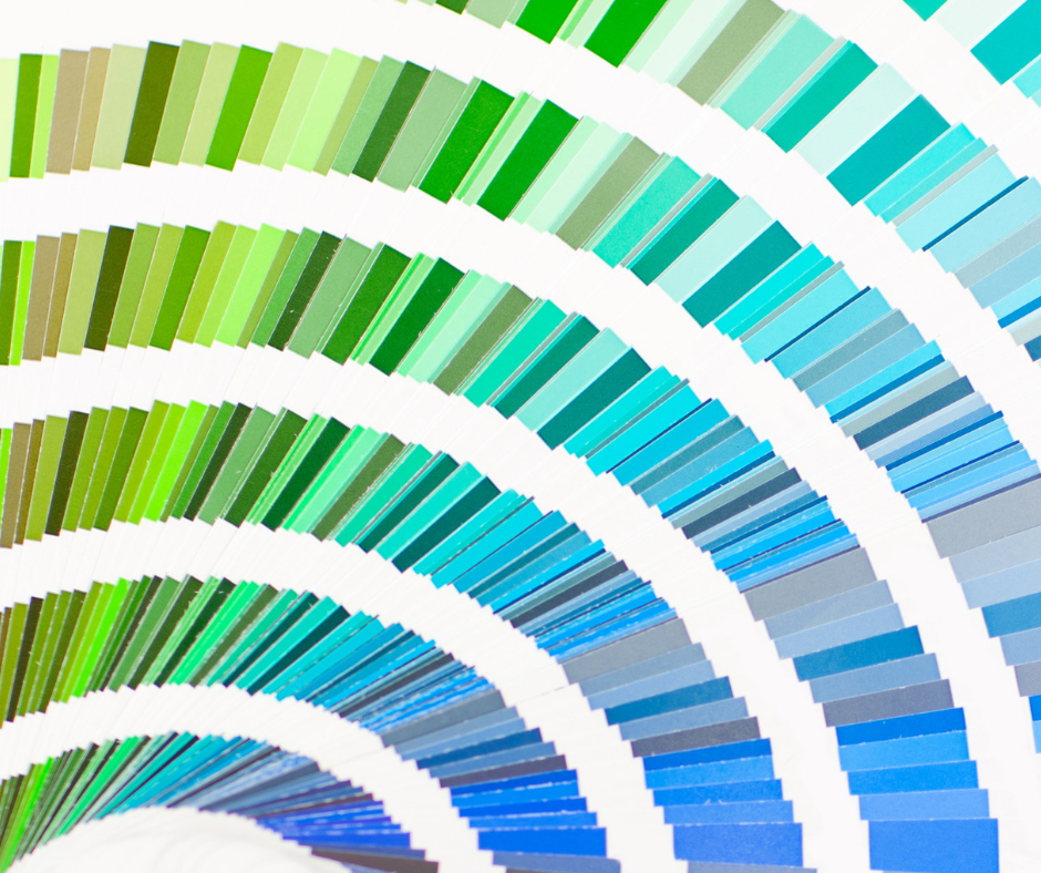
Green and blue, in particular, are said to aid patient healing according to Altrofloors. Blue promotes lower heart rates and green promotes restfulness and balance. Kevin Sink, a nature photographer in Kansas City, MO, has found that his work is particularly helpful to patients. He specializes in providing large-format photos to health care facilities and has partnered with Dr. Henry Domke, author of A Picture of Health: Handbook for Healthcare Art

Kevin Sink_Henry Domke_Happy-Valley_1946KH.jpgIn a blog post, Dr. Domke quotes a 2012 study published in "Psychological Science" regarding the drama of color and light conveyed in photography, particularly broad landscapes. It says, “…participants who felt awe…were less impatient. Experiences of awe bring people into the present moment… and make life feel more satisfying than it would otherwise.” For patients and their loved ones who may be worried in a hospital bed or waiting area, a sense of awe that calms minds, reduces the stress hormone cortisol, and lowers heart rates can allow the body the rest it needs to heal faster.

henrydomke.com_James-River_0380KH.jpgBiophilia, which means “love of life,” according to NOVA, is a hypothesis introduced by Edward O. Wilson in his book of the same title in 1984 that suggests that we have an innate tendency to seek connections with nature. Whether science proves it or not, the idea that humans are drawn to, and boosted by, nature is just common sense to many of us. We feel its truth when the sun warms our face, the fresh green of spring finally arrives, and the vibrant array of colors in the sunset momentarily takes our breath away. Bringing as much nature inside as possible through textures, imagery, light, and color can help us create living environments that are happy and healthy.  (Landscape photo credits: Kevin Sink, photographer, available for purchase at https://henrydomke.com.)

Natural Wood Kitchen.pngBringing it all together

In general, bright shades and bold colors are more energizing with warmth and joy while darker colors are more serious and mysterious. Neutrals like black, gray, white, and brown tend to calm and stabilize emotions primarily because they are void of the influences of both positive and negative emotions. This lack of emotion is exactly why so many interior decorators, architects, and builders use them as a default palette for the main color choices in many living and work environments. They figure these spaces will be attractive to more buyers who can then personalize with colorful accent pieces as desired. There is much logic to this approach, but in many cases, the satisfaction of having an environment that reflects your character can be lost.

Does redecorating your space to make the colors of your living environment work for you instead of against you sound overwhelming? Our advice is to start small. Just paint one wall or change out the color of your bedding or throw pillows to see how you like the adjustment. In the bathroom or kitchen, try experimenting with a new towel color. Just one will give you an idea if you love the color or not. See how it makes you feel at different times of the day and different days of the week. At work, you may just want to try writing with a new pen color. One CEO we know has decided that purple and green are so helpful to his creativity and focus that his team has completely converted the supply closet to those colors. They have to hunt for a black or blue pen when contracts or official documents need to be signed.

Woman with Color Deck.pngWhile research does prove general guidance, everyone is unique. It may be tempting to decorate your space based on the latest design trends on home decorating shows and magazine covers but to live your best life we recommend listening to your instincts. The tests above can help you figure out what works best for you. Once you are ready for some bigger changes, go for a full room makeover and feel fabulous about your choices.

Our Balance Concierge Ambassadors are an excellent resource for helping you save time on researching local contractors to do the actual painting, reupholstering, and staining work. They know where to find the best discounts on supplies, home décor, and furniture. Also, if you are looking for an interior designer or even some help with coordinating all of these helpers, our team stands ready to assist our program members.  Give us a call at 877.502.2201 or Click here to learn more.